Editing "Structured" Free-Text November 28, 2014
If you have worked with a web content management system, you have likely seen a rich text editor, or a "WYSIWYG" editor. Although convenient to use, these editors are responsible for a lot of badly formatted content.
As an all-time advocate for structured information, we strive to build web pages that synthesize content from meta data, or "pure information". Ideally, the content editor should provide just the mere text. For example, a paragraph for a product description; an intro to an event. These texts are then displayed in pre-defined, carefully styled containers.
Free-text editing is the opposite of structured content. The content administrator may inject arbitrary HTML code either through direct code editing or by using a WYSIWYG editor.
To designers and developers, a WYSIWYG editor is a risk factor. There is simply no control or compliance; to a non-technical user, a WYSIWYG editor is limiting. Once the basic formatting options are exhausted, the user quickly resort to direct HTML editing. This, of course, defeats the premise of a WYSIWYG editor while destroying the integrity of the site.
We tackled the issue of semantic free-text editing by first looking at the "language" that's used between the user and the editor. Phrases in this language are expressed as buttons in the editor's toolbar, namely "bold", "italic", "underline", "color", "background color", "insert image", "block quote", "indent", "bullet", "font family", "font size", etc. It turns out that as developers, not only do we not want the end-users to write arbitrary HTML code, we also don't want them to think in these terms when editing the content. Changing the font size of a text is particularly discerning because what seems alright to the user may not look correct on another screen size or device. In this case, what you see is not necessarily "What You Get".

We replaced the formatting buttons with styling - visual concepts that are not tied to a specific presentation. Instead there are buttons for "headlines", "2 columns" and "side columns".

To make editing easier, we give the columns border lines so that it's clear to the user which section is being edited. These guide lines are not visible on the live site.
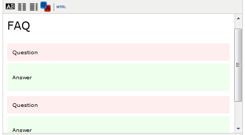
Layout editing is still focusing on presentation. We'd like the user to focus more on the content. A list of Q&As is a good example where the user edits the questions and answers in a strictly paired Q- and A-items.

Again we color coded the containers so that it's easy to edit. On the public facing site the answers will be initially collapsed; their visibility is toggled by clicking on the question links. The styling can be completely different on the back and front end, although they use the same styling markups.
The next example is taken from MBTA. In an ideal setup, the page should be driven by a structured database, with information about all the projects such as their location, budget and description.

If there really is a project data source, we could use a shortcode/plugin approach by simply referencing the data object. Note that even in this case, the title of the listing can be modified by the WYSIWYG editor:

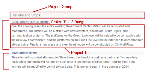
What if the listing is just an unstructured blob of text that appears to be structured? In this case we can introduce two tools: one for creating a project group container; and one for inserting project items. The project hierarchy is expressed by indentation and colour-coded background.

At this point, we have steered the user to a more manageable mindset. Two concepts should have been established by now:
Contextual Templates
Semantic templates can significantly simplify content management. Now we can have templates for all sorts of layouts and content structures. For example, product ratings, review quotes, featured sales, sales blurbs; and the list goes on. The editor's tool bar will soon run out of space for these buttons. What do we do then?
One of the key reasons we haven't seen a reasonable WYSIWYG editor until now is because we focused on creating a general-purpose editing tool. The only way an editor can be generic is to be out of context. Structured presentation of content requires context. Luckily in Gyroscope, each free-text editor is already in the context of its related record. For example, the editor for an event entry may have templates for maps, locations, catering menus; and the editor for a staff member's bio may contain a achievement listing template.
After all the above technical explanation, here's the take-away:
WYSIWYG editors in Gyroscope powered CMS allow the user to manage the structure of unstructured text, while maintaining the integrity of visual designs.
As an all-time advocate for structured information, we strive to build web pages that synthesize content from meta data, or "pure information". Ideally, the content editor should provide just the mere text. For example, a paragraph for a product description; an intro to an event. These texts are then displayed in pre-defined, carefully styled containers.
Free-text editing is the opposite of structured content. The content administrator may inject arbitrary HTML code either through direct code editing or by using a WYSIWYG editor.
To designers and developers, a WYSIWYG editor is a risk factor. There is simply no control or compliance; to a non-technical user, a WYSIWYG editor is limiting. Once the basic formatting options are exhausted, the user quickly resort to direct HTML editing. This, of course, defeats the premise of a WYSIWYG editor while destroying the integrity of the site.
We tackled the issue of semantic free-text editing by first looking at the "language" that's used between the user and the editor. Phrases in this language are expressed as buttons in the editor's toolbar, namely "bold", "italic", "underline", "color", "background color", "insert image", "block quote", "indent", "bullet", "font family", "font size", etc. It turns out that as developers, not only do we not want the end-users to write arbitrary HTML code, we also don't want them to think in these terms when editing the content. Changing the font size of a text is particularly discerning because what seems alright to the user may not look correct on another screen size or device. In this case, what you see is not necessarily "What You Get".

We replaced the formatting buttons with styling - visual concepts that are not tied to a specific presentation. Instead there are buttons for "headlines", "2 columns" and "side columns".

To make editing easier, we give the columns border lines so that it's clear to the user which section is being edited. These guide lines are not visible on the live site.
Layout editing is still focusing on presentation. We'd like the user to focus more on the content. A list of Q&As is a good example where the user edits the questions and answers in a strictly paired Q- and A-items.

Again we color coded the containers so that it's easy to edit. On the public facing site the answers will be initially collapsed; their visibility is toggled by clicking on the question links. The styling can be completely different on the back and front end, although they use the same styling markups.
The next example is taken from MBTA. In an ideal setup, the page should be driven by a structured database, with information about all the projects such as their location, budget and description.

If there really is a project data source, we could use a shortcode/plugin approach by simply referencing the data object. Note that even in this case, the title of the listing can be modified by the WYSIWYG editor:

What if the listing is just an unstructured blob of text that appears to be structured? In this case we can introduce two tools: one for creating a project group container; and one for inserting project items. The project hierarchy is expressed by indentation and colour-coded background.

At this point, we have steered the user to a more manageable mindset. Two concepts should have been established by now:
- Web content has structure, even if it's not data driven
- Use the editor like PowerPoint templates, not Word
Contextual Templates
Semantic templates can significantly simplify content management. Now we can have templates for all sorts of layouts and content structures. For example, product ratings, review quotes, featured sales, sales blurbs; and the list goes on. The editor's tool bar will soon run out of space for these buttons. What do we do then?
One of the key reasons we haven't seen a reasonable WYSIWYG editor until now is because we focused on creating a general-purpose editing tool. The only way an editor can be generic is to be out of context. Structured presentation of content requires context. Luckily in Gyroscope, each free-text editor is already in the context of its related record. For example, the editor for an event entry may have templates for maps, locations, catering menus; and the editor for a staff member's bio may contain a achievement listing template.
After all the above technical explanation, here's the take-away:
WYSIWYG editors in Gyroscope powered CMS allow the user to manage the structure of unstructured text, while maintaining the integrity of visual designs.

