PNG Files Only, Please! March 8, 2014
When working with graphic designers, we have a long standing requirement that the proof deck has to be sent in PNG. In addition, the PNG images should not contain any alpha (transparency) channels unless otherwise requested.
In the past few months, we have received artworks in other formats - JPEG, PDF and even GIF! We'd like to point out, hopefully once and for all, why these formats are unsuitable to exchange intermediate design work.
JPEG uses lossy compression
Graphic designers' favourite defense to use JPEG is this statement:
"JPEGs are for photographs and realistic images. PNGs are for line art, text-heavy images, and images with few colors."
In terms of image quality, the fundamental difference between photographs and line art, is our detection and tolerance of quantization artifacts. When an image is JPEG compressed, fuzzy edges and tinted colour blocks show up. This would be not as detectable in a landscape photograph, but jumps out instantly in a text or line drawing.

Each time a JPEG file is saved, some information is lost; and some artifacts introduced.
PDF doesn't lock down pixel dimensions
It makes sense to send a 20-page web design package in a PDF file so that it can be reviewed like a book - except that it doesn't. PDF is a horrible choice to transmit web graphics. First of all, picture dimensions are not locked down in PDF. When a 100px by 100px rectangle is viewed in a PDF viewer at 100%, the measured size is not 100x100. We could open up the file in a vector editor and perform a 72:1 conversion, but even this ratio can be arbitrarily set. The images that are embedded in the PDF file are not even vector graphics, so what's the point?
Our recommended bundling method is to name PNG files in a sequence and package them in a ZIP file.
GIF has only 256 colors
GIF format support binary transparency. We used to ask specifically for GIF icons for this reason. Unfortunately, the export to GIF function in Adobe products yields substandard quality. Now we craft GIF masks by hand.
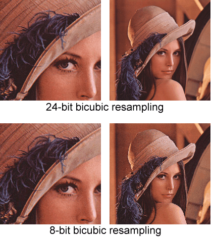
For some images, 256 colours is actually expressive enough. The reason we don't work with 8-bit colour channels is because 256 is no longer enough when the image is bi-cubically resampled:
PNG with Transparency Channels
The only time we would need PNG transparency on a final website is when the background of a image changes. The majority use of logos and banners does not fall into this category. If it is known beforehand that the background of a wall of trademarks on the final webpage is light grey, then by all means use a grey background instead of using transparency.
When transparency is indeed enabled in a PNG file, we ask that the alpha channel contains a reasonable binary transparency boundary:


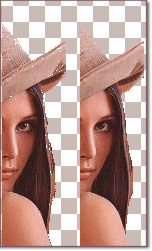
The first mask in the above diagram is strictly binary. The edge of the image does not blend well into the background. The second mask has blurred edges but without a clear binary boundary. As a result, the image looks nice only in browsers that support alpha transparency. The second last image shows what it looks like in older versions of Internet Explorer. The ideal mask should have a thin blurred line that well defines the binary boundary. The result image looks nice on all browsers. (We use TinyPNG to preserve the binary transparency layers).
What about PSD and AI files?
We have worked with some brilliant graphic designers, whose taste and insight have greatly contributed to the overall quality of our products. Although it is convenient for us to be able to extract any layer, and any graphic element in a Photoshop or Illustrator file, we prefer to leave the control to the designer himself. Turning an effect on or off is a judgement call; and this judgement is part of the value a graphic designer has to offer.
In the past few months, we have received artworks in other formats - JPEG, PDF and even GIF! We'd like to point out, hopefully once and for all, why these formats are unsuitable to exchange intermediate design work.
JPEG uses lossy compression
Graphic designers' favourite defense to use JPEG is this statement:
"JPEGs are for photographs and realistic images. PNGs are for line art, text-heavy images, and images with few colors."
In terms of image quality, the fundamental difference between photographs and line art, is our detection and tolerance of quantization artifacts. When an image is JPEG compressed, fuzzy edges and tinted colour blocks show up. This would be not as detectable in a landscape photograph, but jumps out instantly in a text or line drawing.

Each time a JPEG file is saved, some information is lost; and some artifacts introduced.
PDF doesn't lock down pixel dimensions
It makes sense to send a 20-page web design package in a PDF file so that it can be reviewed like a book - except that it doesn't. PDF is a horrible choice to transmit web graphics. First of all, picture dimensions are not locked down in PDF. When a 100px by 100px rectangle is viewed in a PDF viewer at 100%, the measured size is not 100x100. We could open up the file in a vector editor and perform a 72:1 conversion, but even this ratio can be arbitrarily set. The images that are embedded in the PDF file are not even vector graphics, so what's the point?
Our recommended bundling method is to name PNG files in a sequence and package them in a ZIP file.
GIF has only 256 colors
GIF format support binary transparency. We used to ask specifically for GIF icons for this reason. Unfortunately, the export to GIF function in Adobe products yields substandard quality. Now we craft GIF masks by hand.
For some images, 256 colours is actually expressive enough. The reason we don't work with 8-bit colour channels is because 256 is no longer enough when the image is bi-cubically resampled:

PNG with Transparency Channels
The only time we would need PNG transparency on a final website is when the background of a image changes. The majority use of logos and banners does not fall into this category. If it is known beforehand that the background of a wall of trademarks on the final webpage is light grey, then by all means use a grey background instead of using transparency.
When transparency is indeed enabled in a PNG file, we ask that the alpha channel contains a reasonable binary transparency boundary:


The first mask in the above diagram is strictly binary. The edge of the image does not blend well into the background. The second mask has blurred edges but without a clear binary boundary. As a result, the image looks nice only in browsers that support alpha transparency. The second last image shows what it looks like in older versions of Internet Explorer. The ideal mask should have a thin blurred line that well defines the binary boundary. The result image looks nice on all browsers. (We use TinyPNG to preserve the binary transparency layers).
What about PSD and AI files?
We have worked with some brilliant graphic designers, whose taste and insight have greatly contributed to the overall quality of our products. Although it is convenient for us to be able to extract any layer, and any graphic element in a Photoshop or Illustrator file, we prefer to leave the control to the designer himself. Turning an effect on or off is a judgement call; and this judgement is part of the value a graphic designer has to offer.

