The Tale of Gyroscope 5.5 August 8, 2014
View all articles from Gyroscope Development Blog
Good news - the newly released Gyroscope 5.5 offers optimized support for a wide range of Android devices (both tablets and phones) and Android based browsers (stock, Firefox, Chrome). It also works on Blackberry Playbook (nobody uses it but we support it anyway).
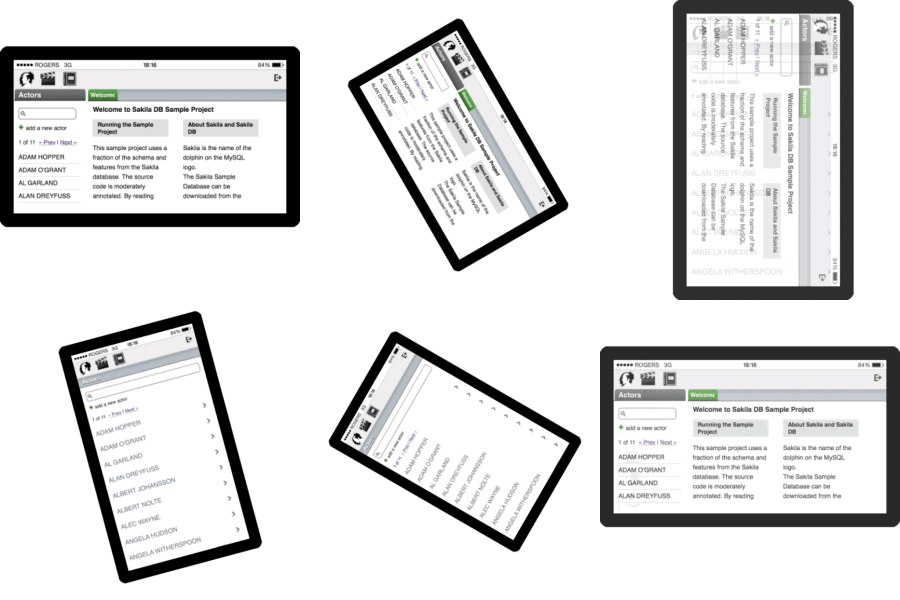
Since version 1.3, Gyroscope has a unique mobile feature called Adaptive Orientation Layout. When the device is held in landscape mode, the application works similar to its desktop counterpart. When the screen is rotated to portrait mode, the layout of the application transforms to that of a typical iPhone application.
This has worked well on iPhone and the Chrome browser on Android phones.

Gyroscope 5.5 aims to bring a more optimal experience on other popular devices such as tablets. It also attempts to keep a long standing tradition - out-of-the-box compatibility. In the case of Android, the default browser has to be supported because we can't expect the users to download Chrome or Firefox.
Universal Adaptive Orientation support seemed like a simple task at first. We could just use media query for the looks, and hook the onorientationchange event for additional transformation. It turns out that we had to clear a minefield of technical limitations and settle device, OS and browser differences.
Orientation Code Inconsistency
Each direction your tablet is facing has a code. In iPhone's case, the landscape view is either 90 or -90, depending on which way you are holding. Both portrait directions are 180. There is no way to tell whether the device is held upside down in portrait mode, although you can tell physically by the location of the Home button.
Tablets have inverted orientation codes. 90 and -90 mark portrait views; 0 and 180 for landscape views. We use device detection to set the orientation inversion flag.
There is no orientation event in Firefox
The Android version of Firefox doesn't fire onorientationchange event. Yet window.onorientationchange evaluates to true in Firefox. We had to inspect the type of this object to determine whether it is truly supported. We use onresize along with matchMedia to emulate the orientation event.
What further complicates the matter is that Chrome and mobile Safari support these events too. We had to disable the onresize handler if the orientation event is supported. This is crucial for the next compatibility issue: Chrome Keyboard.
Chrome Keyboard Side Effects
When an input field is clicked, the virtual keyboard slides up. In most browsers this triggers a resize event, which we can easily ignore. Chrome, however, tells the browser that the screen has been rotated! This is problematic for media query because the layout changes to the incorrect mode when the user interacts with an input field.
We had to manually load two sets of CSS files based on the logical orientation of the screen, as determined by JavaScript routines.
Keyboard Layout
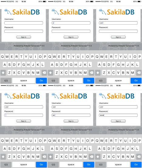
The last improvement is trivial yet much celebrated. We noticed that the virtual keyboard doesn't always have a "Next" button to hop around input fields. This is cumbersome for the login screen. We have made it so that when the user hits "Enter/Go" after only entering the user name, the password field is automatically in focus. Interestingly, hitting Go on a Next-enabled keyboard hides the keyboard. So we recommend using the Next button when it is present, and using Go otherwise.

Since version 1.3, Gyroscope has a unique mobile feature called Adaptive Orientation Layout. When the device is held in landscape mode, the application works similar to its desktop counterpart. When the screen is rotated to portrait mode, the layout of the application transforms to that of a typical iPhone application.
This has worked well on iPhone and the Chrome browser on Android phones.

Gyroscope 5.5 aims to bring a more optimal experience on other popular devices such as tablets. It also attempts to keep a long standing tradition - out-of-the-box compatibility. In the case of Android, the default browser has to be supported because we can't expect the users to download Chrome or Firefox.
Universal Adaptive Orientation support seemed like a simple task at first. We could just use media query for the looks, and hook the onorientationchange event for additional transformation. It turns out that we had to clear a minefield of technical limitations and settle device, OS and browser differences.
Orientation Code Inconsistency
Each direction your tablet is facing has a code. In iPhone's case, the landscape view is either 90 or -90, depending on which way you are holding. Both portrait directions are 180. There is no way to tell whether the device is held upside down in portrait mode, although you can tell physically by the location of the Home button.
Tablets have inverted orientation codes. 90 and -90 mark portrait views; 0 and 180 for landscape views. We use device detection to set the orientation inversion flag.
There is no orientation event in Firefox
The Android version of Firefox doesn't fire onorientationchange event. Yet window.onorientationchange evaluates to true in Firefox. We had to inspect the type of this object to determine whether it is truly supported. We use onresize along with matchMedia to emulate the orientation event.
What further complicates the matter is that Chrome and mobile Safari support these events too. We had to disable the onresize handler if the orientation event is supported. This is crucial for the next compatibility issue: Chrome Keyboard.
Chrome Keyboard Side Effects
When an input field is clicked, the virtual keyboard slides up. In most browsers this triggers a resize event, which we can easily ignore. Chrome, however, tells the browser that the screen has been rotated! This is problematic for media query because the layout changes to the incorrect mode when the user interacts with an input field.
We had to manually load two sets of CSS files based on the logical orientation of the screen, as determined by JavaScript routines.
Keyboard Layout
The last improvement is trivial yet much celebrated. We noticed that the virtual keyboard doesn't always have a "Next" button to hop around input fields. This is cumbersome for the login screen. We have made it so that when the user hits "Enter/Go" after only entering the user name, the password field is automatically in focus. Interestingly, hitting Go on a Next-enabled keyboard hides the keyboard. So we recommend using the Next button when it is present, and using Go otherwise.


