Gyroscope / User Interaction Model
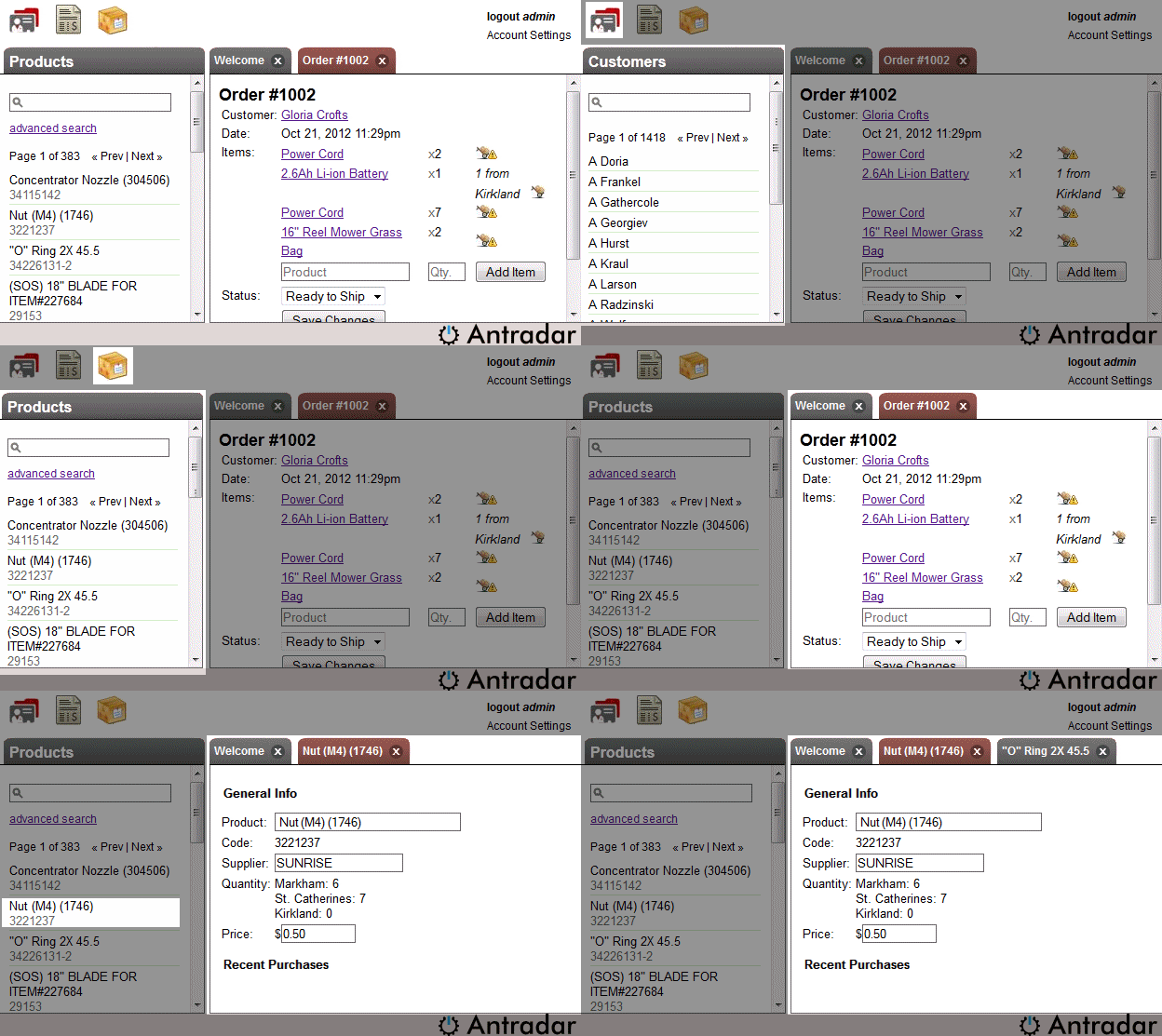
Gyroscope uses lists and tabs to represent relations between data objects.A typical Gyroscope application has the following views: menu icons, lists and tabbed detail views.

The menu icons are the entry points to key functional components. For example, "Clients", "Orders", "Products" and "Suppliers" can each have its corresponding icons. These collections are called, in technical terms, "Entities".
Records of each entity are displayed in the left panel. The record lists overlap each other; only the current active entity is visible. For example, clicking on the Clients button brings up a list of clients, while clicking on the Suppliers button replaces the view with a list of suppliers.

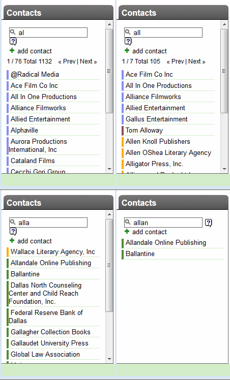
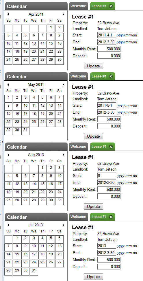
The left panel also displays auto-complete lists such as name lookup, calendar, related records, etc.:

Each record in the list serves a natural entry point to the detail record view. This view is usually displayed in a tab on the right hand side.
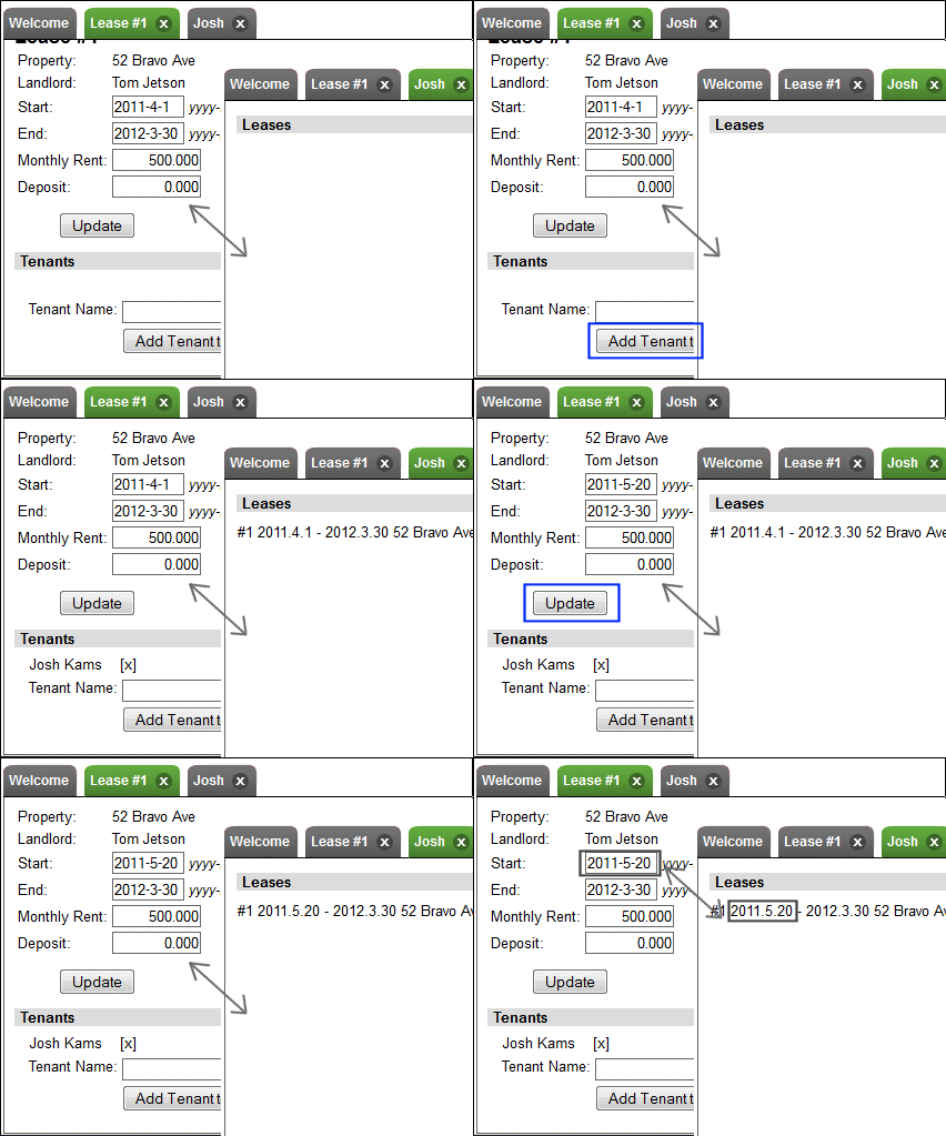
A proper Gyroscope application keeps related content in different tabs synchronized. In the example of a rental property application, which we'll see in the sample project, when the lease date is modified in the lease view, the lease summary section in the tenant view is also updated without having to reload any pages or tabs.


